Painting with Acrylics: Liquitex Muted Colors
Discover how using muted colours can make your sunny colours sing!
Join artist Jan Poynter as she introduces Liquitex Muted Colors, a convenient line of pre-mixed muted acrylics that allow artists the ability to achieve the same desaturated hue every time. Using the muted Heavy Body Acrylics, Soft Body Acrylics, and Acrylic Inks, Jan skips the handmade muted colours she usually creates, and jumps right into painting a sunny Mexican scene, with shadows and mid-tones that make the brighter colours pop.
Watch Painting with Acrylics: Liquitex Muted Colors above or on the Opus YouTube Channel to learn how Jan uses muted colours as a line drawing, underpainting, glaze layer, and as a complimentary colour that makes the sunny colours sing!
PLUS Read our exclusive Muted Colours article below that dives deeper into the special importance muted tones play in an artists practice.
Interested in the products Jan uses?
Liquitex Special Release Muted Colors Collection
Liquitex Professional Acrylic Inks
Liquitex Heavy Body Artist Acrylics
Liquitex Professional Soft Body Acrylics
Opus Matte Medium
Liquitex Airbrush Medium
Opus Bravura Brushes
Opus Legato Brushes
Liquitex Painting Knives
Canson Canva Artboards
Sta-Wet Super Pro Palette
Muted colours are traditionally mixed by artists to decrease the intensity or saturation of a hue and achieve a more subtle colour. The results appear as a more neutral, greyed tone that can be used for creating realistic shades and shadows, attaining subtle underpaintings and glazes, and painting scenes in nature. This makes them perfectly suited for painting en plein air, capturing shadows and foggy scenes, and painting the iconic blues, greens, and greys of the BC landscape.
Muted tones also contrast and complement pale saturated colours without having to rely on vivid bright colours, which do not tend to accurately represent what we see in nature. Whether you’re depicting a rainy landscape or a sunny day on a beach in Mexico, desaturated colours will help any lighter spots pop off the canvas.
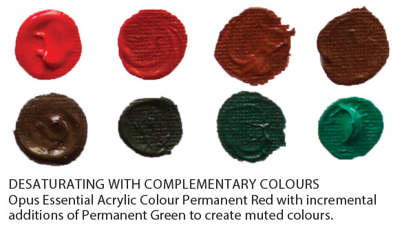
Artists can create muted colours by adding hints of a complementary colour to their hue. This will decrease the chroma (intensity) of your original colour, creating a muted tone. For instance, if you wanted to reduce the saturation of a bright red hue, you would choose its complementary colour, green, and slowly add green until you’ve reached the desired level of desaturation.
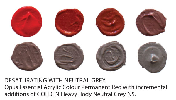
Another way that artists can achieve desaturated colours is by adding a neutral grey. You can either create your own neutral grey, or use it straight from the tube. GOLDEN Heavy Body Acrylic Colors offer six Neutral Grey colours, from N1 (the darkest) to N6 (the lightest), Gamblin’s Portland Grey (warm) is a popular grey for muting oil paints, and Winsor & Newton Watercolours and Van Gogh Watercolours both produce neutral greys for watercolour artists.
The new Liquitex Professional Muted Color Collection offers 5 muted tones ready-mixed in their Heavy Body, Soft Body, and Inks. We asked Sunshine Coast-based artist Jan Poynter to test this new line and she found these convenience colours a wonderful option.
Prior to using Liquitex Muted Grey, Jan used to create a custom purple-toned grey that she would use as a muted grey colour for shadows and glazes, or for desaturating her bright colours. “I used to spend ages making extra special containers of this colour; I could never get it the same.” The benefit of using a grey from the tube is that you will always have the same grey consistently.
From here, you can control the hue of your muted colours by mixing in some Titanium White to create an array of pale colours, or you can darken them even further to create an array of rich black tones. The possibilities of your muted colours are endless!
Unsure of which method you should utilize in your work? Experiment with the desaturation methods, and create colour charts for your personal reference; this will allow you to see which colours you prefer to use in your work, or pick the right colour for the scene you’re painting. Start by mixing small amounts of your colours, and see how quickly your tonal values will change. You can also work with muted colours that come straight from the tube, that are already desaturated for your convenience. •