Balancing Acrylic Paints for Marbling
May 26, 2021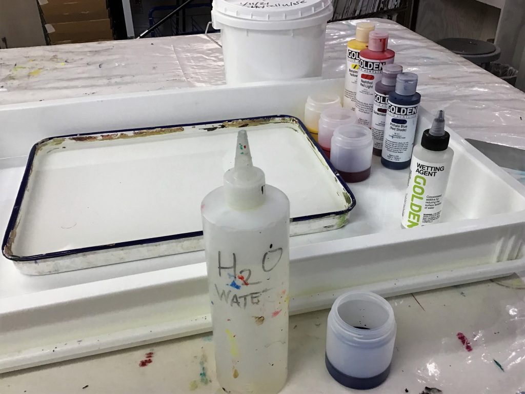
What is Marbling?
“Marbling” is the time-honored artist technique where thinned paints are placed onto a thickened “bath” usually made from carrageenan or methylcellulose. The paints float on the surface of the bath and can be manipulated into beautiful and intricate designs, then printed onto paper, fabric, or another material prepared with a “mordant”.
Marbled papers were an important bookbinding commodity for centuries. You can still find books where these imported papers were fastened to the inside of book covers. Therefore, each step was a closely guarded secret in marbling guilds and it took some time before this information become accessible. Lucky for you, there are many books explaining each part of the process.
A critical requirement for successful marbling is modifying the paints so they properly float and spread on the surface of the bath. You do not want them to sink down into the bath or aggressively spreading across the bath. One color that is overly pushy can ruin your design. Acrylic paints need to be balanced so that each color will behave like all of the rest. This article focuses on one way to attempt this.
Before We Get Started…
It is helpful to appreciate the science behind the marbling process so that the system of balancing colors proceeds logically. The main factor at play is understanding “surface tension”. The marbling bath needs to have a high surface tension to keep paint on the surface and not submerging to the bottom. Conversely, the paints should have a low surface tension. These differences create the dynamic of floating colors. Ideally we want a drop of paint to spread several inches in diameter, and every paint to equally spread out. If each paint isn’t in balance you will notice it causing problems that limit what you can do. However, a slightly pushy color can be of help sometimes as it concentrates the other colors in the tray and they will become more intense. The key word is “slightly” pushy, so that it will still play well with the other colors.
Gather These Materials:
- Acrylic Paints – Such as GOLDEN Fluid Acrylics
- Surfactant – Such as GOLDEN Wetting Aid
- Several gallons of drinking water (free of salts, excessive chlorine, etc.)
- Paper – get some decent quality copy paper for testing and use better paper for an actual project. Test papers do not need a mordant.
- Alum – used as the mordant to prepare the paper.
- Bath Base (Methylcellulose or Carrageenan).
- Small Trays – Shallow Plastic or metal that are between 1”-3” tall. Avoid deep or bowed trays.
- Drying lines/paper or clothes line clips, or some plastic sheeting to drape over tables and the floor.
- Rags and old towels. Marbling is MESSY!
- Toothpicks, paperclips, or similarly skinny items used to manipulate the pattern.
- If you have never marbled before, obtain a book or two. We also have an application sheet to help as well.
Factors that Influence Marbling Paints
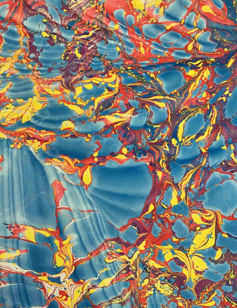
If your paints are properly balanced, they will not push each other around and the color edges will be crisp and smooth. Take the time to try each color over the others to avoid incompatibilities. Some factors are almost impossible to predict or understand. Others are more noticeable the more marbling you do, but each factor will become apparent soon enough. Keep a notebook that lists studio temperature, humidity, the water (tap, bottled, deionized, etc.) used to make the bath and thin the paints. Don’t make big batches of paint until you get the idea of what it will take to make each color work. Use small containers or a plastic watercolor palette.
An experienced marbler has had plenty of failure and understands that good note taking and following recipes and processes is critical to repeated success. Even if eventually your goal isn’t traditional paper marbling, knowing how to control color in the tank is valuable information. It can be just as valuable to know when there are unusual but pleasing effects at play that may not continue into the next day or even the next hour. Sometimes the magic that plays out during a session may never be able to be repeated again, so strike while the iron is hot! But when you are first starting out, it’s best to just focus on making a balanced set of colors.
Choosing Paints
Some marblers prefer using Heavy Body Acrylics because they require more thinning, which in turn reduces surfactants and other additives present in the paint. These work better on thinner baths. Other marblers use Fluid Acrylics. I prefer Fluid Acrylics because they are easy to mix with less color globs. Adding water into the paint increases surface tension and makes the paints thinner as well. Lower surfactant levels provide more control when working with more aggressive paints., but if the paint is too thin and watery, it doesn’t behave as much like a paint, which can create a more transparent and blotchy color field. Overall, you can use whatever paints you want to use, but if you haven’t done much marbling it tends to be helpful to use just one type of paint and not mix Heavy Body with Fluids and High Flow Acrylics.
Color choices are your choice as well, but for the first time trying to balance colors, start with a small set of primaries. Once you get going, you can always mix additional colors to extend your color range.
It is important to appreciate that every paint color employs unique pigments and formulas, so do not expect them all to behave the same way as other colors when marbling. This can make it extremely frustrating trying to figure out what is causing the issue. If you find a paint color not working well and adjusting the mixture doesn’t seem to make any improvements, try a similar color and see how it goes. For example, if you find Quinacridone Red difficult to balance, try Pyrrole Red, or Naphthol Red, or even Quinacridone Crimson.
The Balancing Process
Begin by making a batch of bath. Companies that sell carrageenan and methylcellulose typically provide mixing instructions, so follow them closely. Make the marbling bath the same way as you intend to do for the larger actual marbling session, or pull a small quantity from the larger mixture that is freshly made to ensure the paints should work as they did during the balancing process. Pour the bath into the tray and let it rest while you start in with the colors.
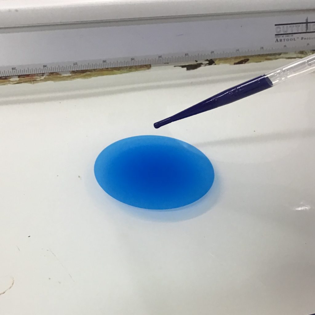
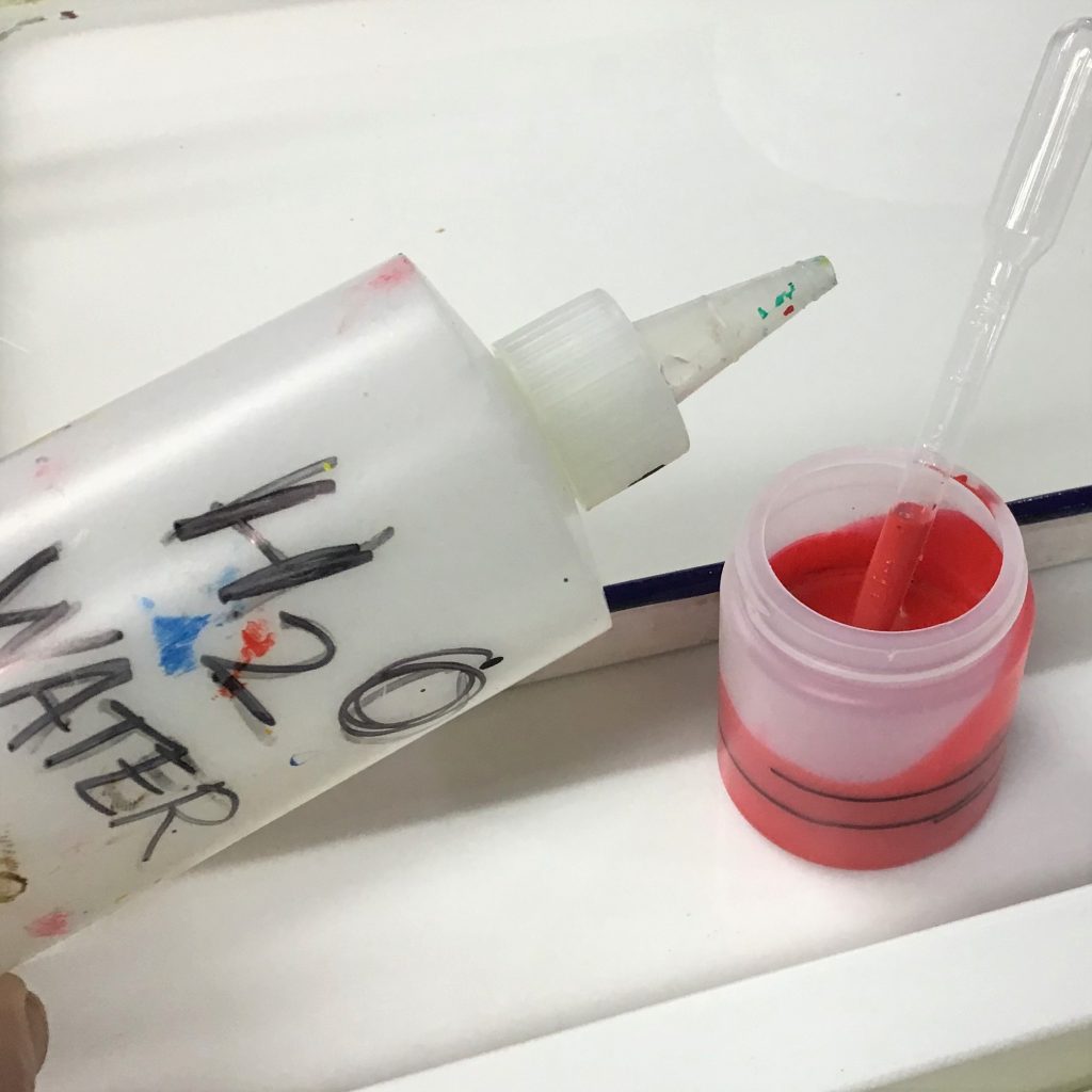
Put some paint into jars, but no more than 1/3 of the jar. You may need to double the paint amount with water and/or Wetting Aid as you balance, so give yourself some room to stir and mix. Besides, a little bit of paint goes a long way when marbling. When adding water, I will use a marker to indicate the paint level and then eyeball the water amount. I tend to add water at around 3:2 (paint to water) to each color to start, and then see what a drop does in the tank.
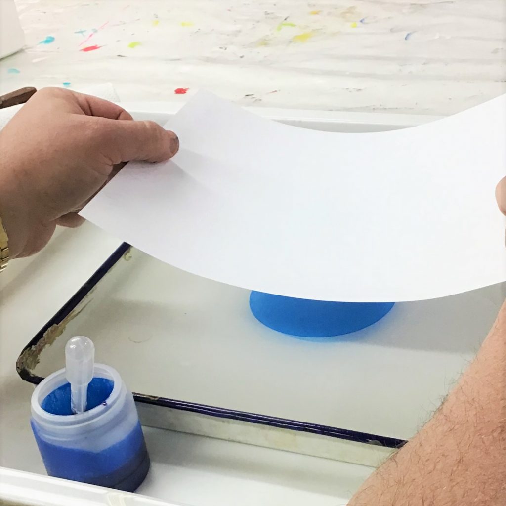
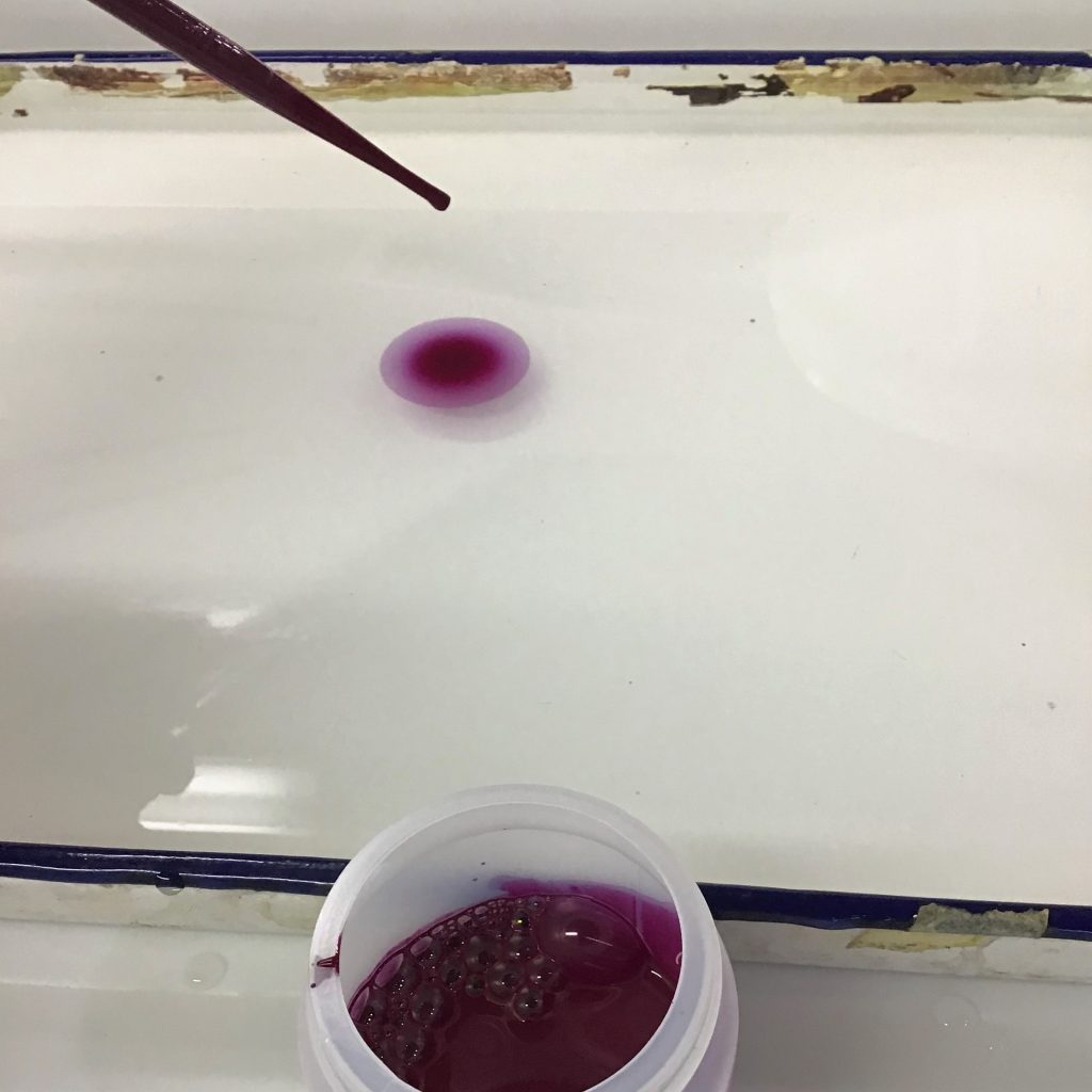
Next, using an eye-dropper or a “pipette”, place just one drop of the color mixture onto the bath. And just observe.
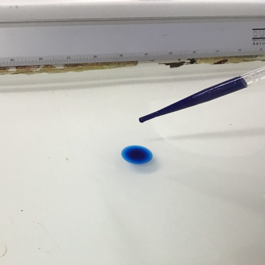
A drop of paint should have no problem spreading on the surface, but the key is to allow the drop to reach its maximum diameter and then see if it keeps going, stops, or shrinks. A shrinking paint at this part of the process will very likely sink down into the bath.
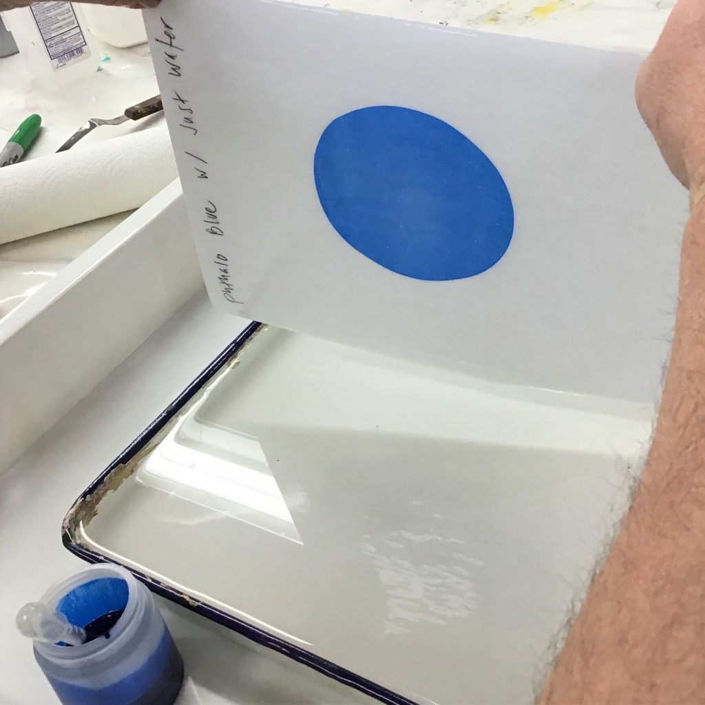
Using a piece of copy/ink-jet/laser paper, I note the mixture, and pull the print from the surface. Note: This process is going to make a mess somewhere, so plan ahead and cover a decent sized table with plastic.
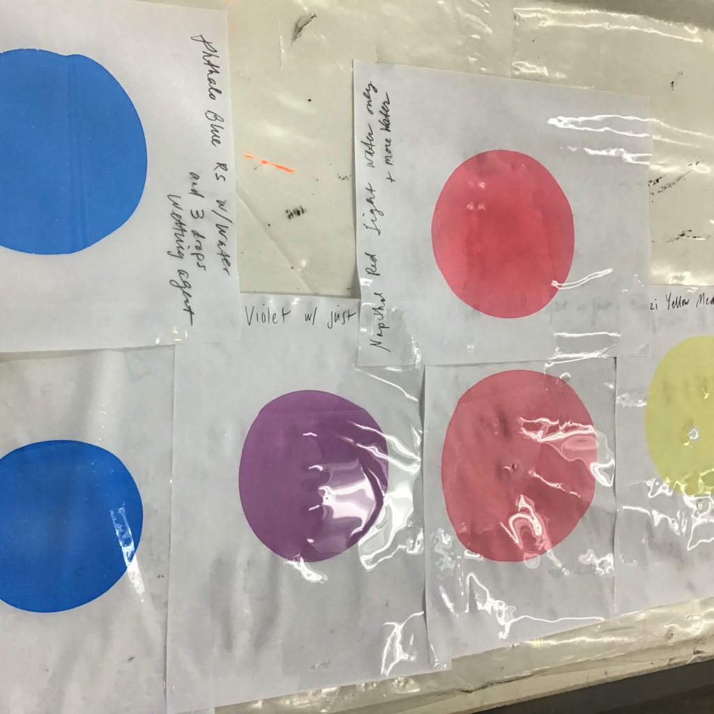
Then repeat the process with the next color: Quinacridone Violet.
Compare the spread diameter of each color by simply laying them out next to each other. As you can see, some colors are bigger than others.
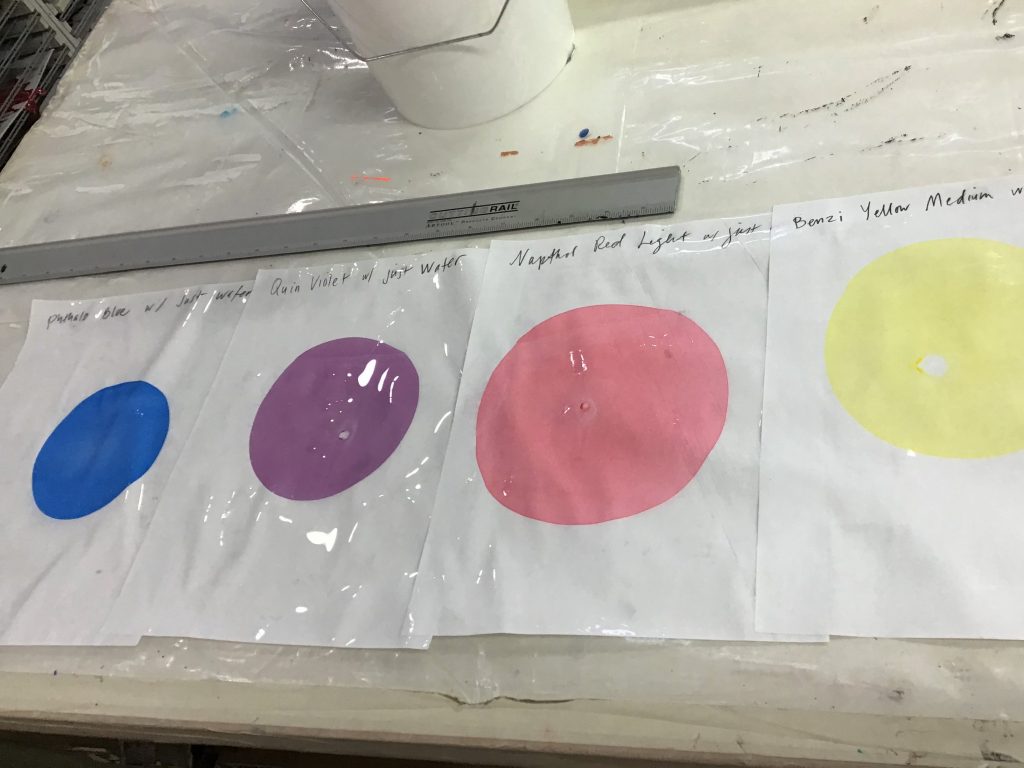
Now we need to adjust. You have a choice to make as to which direction you prefer to go. I went with adding water into the Naphthol Red Light to see if I could reduce the spread rate.
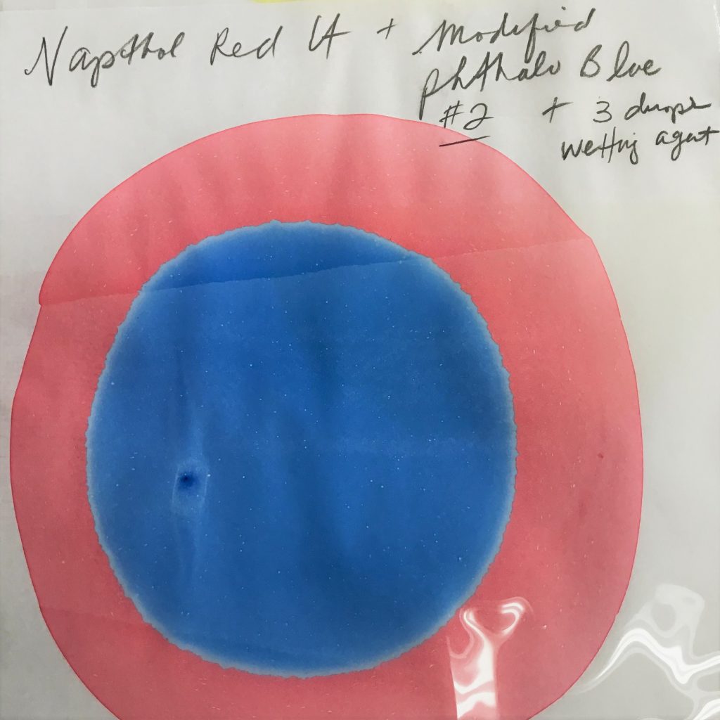
Adding water increases the surface tension because water inherently has a high surface tension. As you can see, the diameter did not reach the same width as the original test. The Phthalo Blue (Red Shade) is the smallest, so we will use just three drops of Wetting Aid (a strong surfactant) into the mixture. Note that the diameter is wider and the color is lighter but also more uniform. You can choose your preferences that are most important to you, but that light blue should intensify when it comes time for actually marbling with the paint. Try to make them as close to the same diameter as possible.
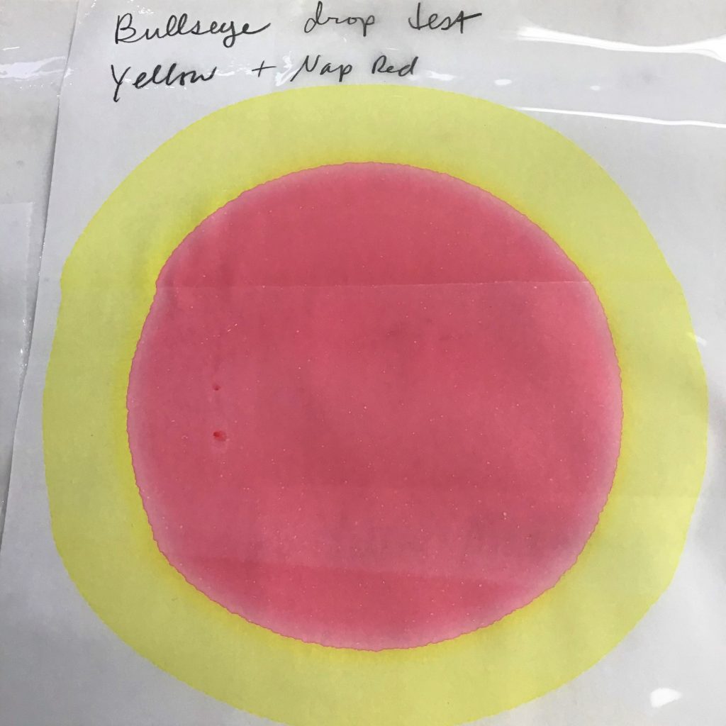
Once the colors are all around the same diameter, begin the second phase of testing called the “bullseye” test. A color is applied via pipette as before, but upon spreading, another color is dropped inside of the first. An aggressive second color will push the first color into a skinny ring. A weak one will never spread enough and can even shrink (and drop down into the bath).
Repeat this testing until each color has been used as the first and the second drop. You may find the need to adjust the colors again, if one is being a bully and overly-concentrating the other colors. What’s going on with Phthalo Blue?
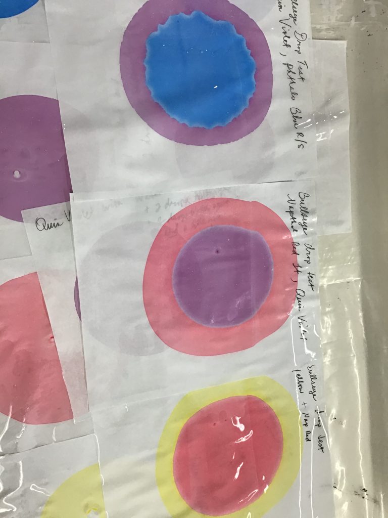
These colors are pretty decently even. If they were not, the second color would push the first color into a very thin band around it, or the first color makes it difficult for the second color to spread out properly. If this happens, it’s almost certain that the color that cannot expand will ultimately drop down below the bath surface.
The blue was acting weird, and needed additional adjusting until it developed smooth edges.
After you achieve colors that are balanced, it helps to then do some real-world marbling. If there are colors still not balanced, observe and make on-the-fly corrections. If the difference is minor, it might just be best to use it earlier, or later in the process. Sometimes that pushy color can be used near the end to concentrate the other colors really well, but it may not be a great option for everyone.
After doing some successful test pieces, you should be ready to get out the good paper or fabric and start your session. If you are not happy with the results, you may need to try a different color (I’m not particularly pleased with the Benzimidazolone Yellow, so I might try another yellow). These paints can keep for a while (a couple of months is about as far as I will go, but the longer thinned paints sit around, the more likely the pigment and other dense materials will separate and you might start getting odd results.
Older mixtures should be mixed really well, and even then test them. One last note: If one color just keeps evading your adjustments, try another color that you have. One big reason to start with primary colors is that you can also mix secondaries and tertiaries if a unique single pigment doesn’t want to play nice. Chromatic blacks might work when Carbon Black does not.
Let us know if you have any questions, or have your own method you’d like to share with others! Leave a comment or contact us at help@goldenpaints.com.
Article by our friends at GOLDEN, Just Paint (by