Nature’s Abstractions
February 13, 2020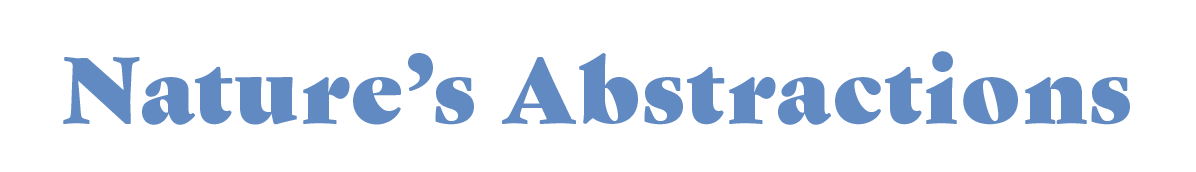
British Columbia boasts some of the most beautiful and unique terrain on the planet. This wild landscape, even in its urban form, has long entranced its inhabitants and inspired generations of artists.
Whilst there are many ways of expressing our surroundings, we’re interested in alternative ways of seeing the natural environment. By moving away from the narrative subject and placing more emphasis on aesthetics (colour, value, shape, composition or texture), the artist allows the viewer to delve deeper into the essence of a location.
How can we successfully communicate the energy of life and nature in our province, by letting go of clear representation?
“My approach to a landscape is not to document it, but rather to capture the essence of it.”
BLU SMITH
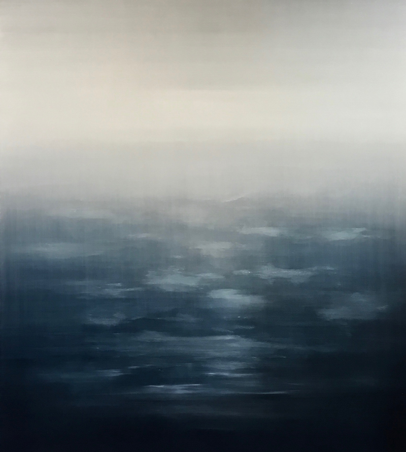
 King Tide
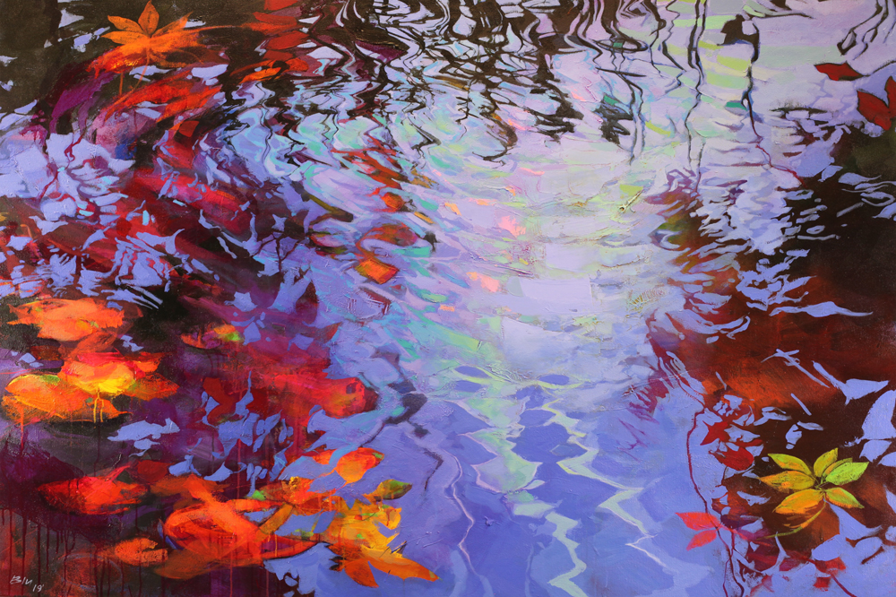
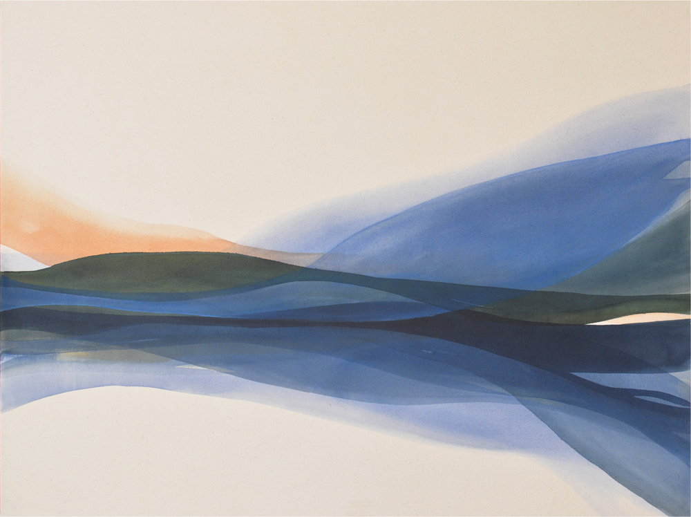
Venetian Red
How would you describe your work and what’s your technique?
First and foremost I consider myself an abstract painter. For nearly 20 years my work exclusively focused on non-representational abstract painting. It has since evolved into an exploration of the light-filled spaces of the Canadian West Coast.
Abstraction is the vehicle and colour is the fuel. These two are deeply intertwined in my paintings. Without one there is no other. My work is intuitive and the thinking is done on the canvas during the process, not beforehand. A painting will ebb and flow and go through many versions until I feel I get it right.
What is it about British Columbia that inspires you?
It’s all about the light. Before any landscapes were painted or I had a brightly lit, new studio, I was just an abstract artist working in a dark basement with all the windows blacked out. My wife and I had recently moved to a hillside home on the Saanich Peninsula with a view of Mt. Baker. Every morning I would be in the kitchen, pouring my coffee and getting ready to descend into the darkness when the sun would begin to rise from behind Mt. Baker. The dawns were spectacular! I began to take mental snapshots of the light and colours that filled the morning sky. Once in the dark studio I began to introduce that light into my abstracts and infuse them with colour and a glowing sense of atmosphere that transformed them from two dimensions into a representation of depth and space.
The second shift came in 2013 when our young, growing family moved to the lush and thickly forested area of North Saanich. Sadly, the glowing morning sunrises were gone but filtering light, peering through the trees that surrounded our new home, replaced them. The scale of the towering Douglas Firs and the way the light crept down deeply affected me as well as my art. As a result, I found a new direction in my work and embarked on a journey exploring abstracted landscapes of Vancouver Island.
Abstraction requires vision – what approach do you employ to see more deeply?
In the beginning I was a young painter experimenting with different styles, including pop art and realism. I had developed a technical proficiency with these styles but that’s all it was – technical skill. I had yet to tap into my creative potential. As an exercise I wanted to attempt a few loose, non-representational abstracts to inject some creativity back into my realistic works. From that moment forward I knew abstraction was the path for me and I never looked back. I took a different approach to learning. I chose not to take a subject and reinterpret it abstractly but rather remove all subject matter and build a language through basic colours, shapes, lines and compositions. I had to rebuild my creative foundation by tearing down what I knew, starting over one brick at a time. I completed hundreds of studies on paper, working very quickly within the first few years. Through repetition I began to notice specific patterns in how I worked. The way I applied brush strokes, how my arm moved, the way I repeated certain shapes and colours. Looking back now I can see that I was learning a new language and expanding my creative vocabulary. I was teaching myself how to speak in my own artistic voice for the first time. Only after I had mastered this language could I then take what I saw around me and reinterpret it through abstraction.
My approach to a landscape is not to document it but rather to capture the essence of it. It becomes a version of paradise with all the beauty, colour and light of what I witness everyday outside my home.
Do you have any advice for people wanting to experiment with abstract art?
Start simple and allow your work to evolve naturally through repetition. Let your next piece build off the previous work. Take elements that work in a piece and expand those elements in the next work. Through repetition, your own personal style and unique signature will emerge. Allow yourself to take chances and liberties that you never would in your realistic pursuits.
Can you tell us a bit about the materials you use and the role they play in your work?
I am predominantly an acrylic on canvas painter. The surfaces I work on can be heavily built up with thick layers of paints and mediums. I incorporate heavy-bodied molding pastes and stucco for texture, gloss and matte mediums for desired surface sheen, glazing liquids for thinly-veiled sheets of transparent colour and use both heavy-bodied and fluid acrylics for various desired effects. All of these materials are tools that help me elevate my work from a flat, two-dimensional plane to a tactile third dimension.
“The true beauty in art is its opportunity for freedom.”
CYBELE IRONSIDE
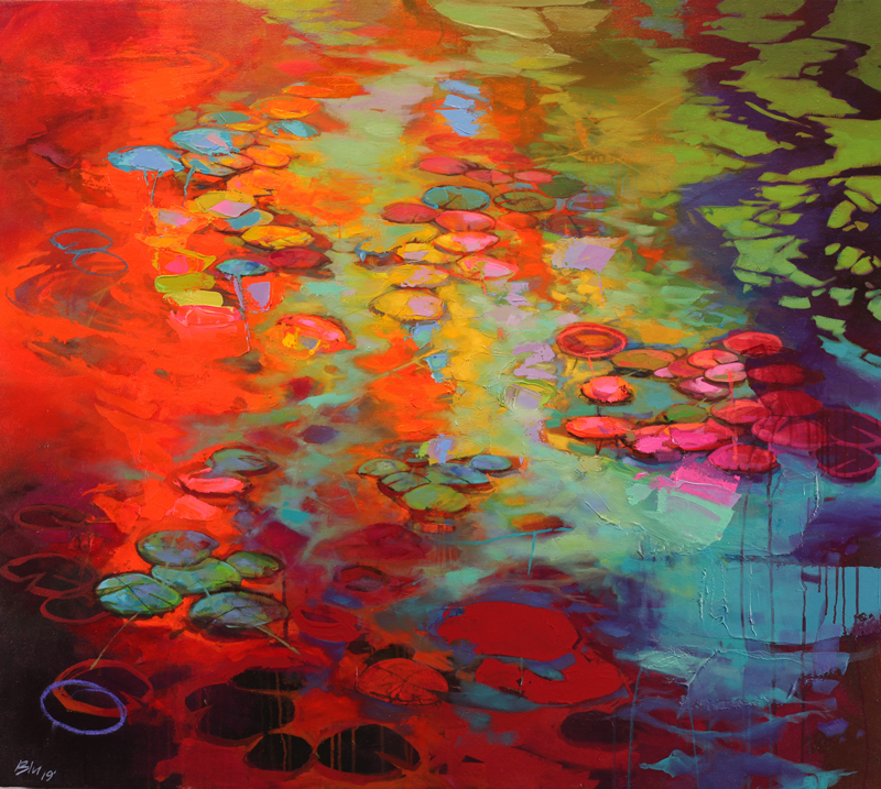
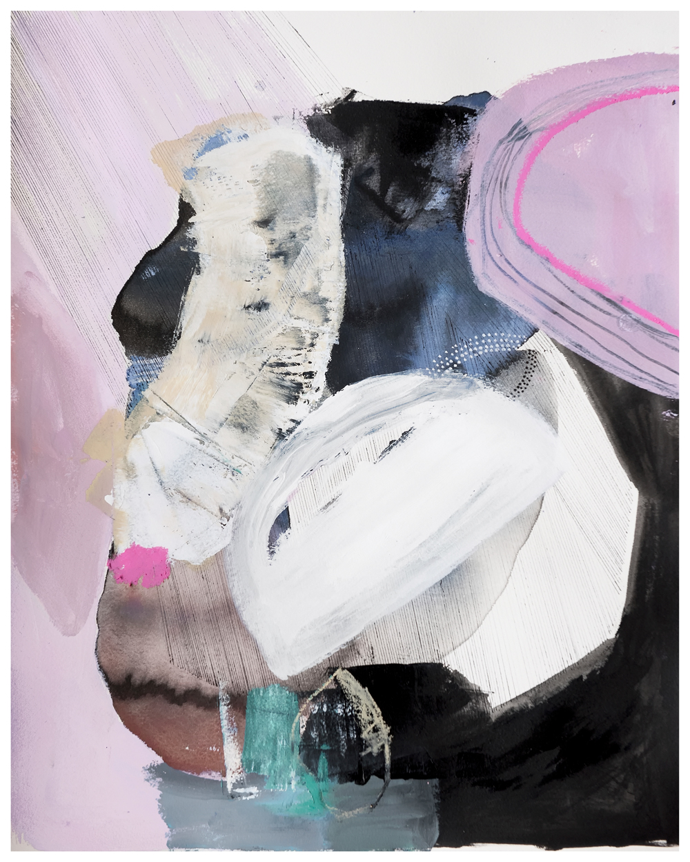
Entropy
Gaze
How would you describe your work and what’s your technique?
I try to distill both the inviting and haunting aspects of the BC landscape and ultimately want my paintings to have a calming, meditative effect on their audience. My technique is to apply the oil pigment into a glazing type medium and move the paint around with both brush and knife to explore shapes and compositions. I developed this layered approach over several years, in which abstraction allows feeling to override outward form.
What is it about British Columbia that inspires you?
The continuous process of death, decay, and rebirth found within the changes of our four distinct seasons inspires me. I’m also influenced by the dramatic, meteorological changes in our skies and they way these fluxes manifest themselves on land and water.
Abstraction requires vision – what approach do you employ to see more deeply?
As a starting point, I generally get going from one of 4-5 compositions I know well. I’ll then explore spaces between the form and lines and begin to add and remove paint until unique shapes emerge into a composition that excites me.
Do you have any advice for people wanting to experiment with abstract art?
The advice given to me when I made the transition from representational to abstract, was to start a composition I was familiar with and then change it quickly, by using a new tool and altering what I’d done. I call this my “search and destroy” method which basically means I drift between representation and abstraction until I find a satisfactory middle ground. It’s important to know when to stop between layers.
Can you tell us a bit about the materials you use and the role they play in your work?
I use all Gamblin products from the ground up. My substrate is usually panel. I use wide brushes to apply a tinted glazing medium and then break up the surface where desired with different palette knives.
“The intersections and disruptions of colour along the canvas are kindred to those along the coast.”
LAUREN MYCROFT
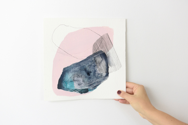
Spread Like Fog
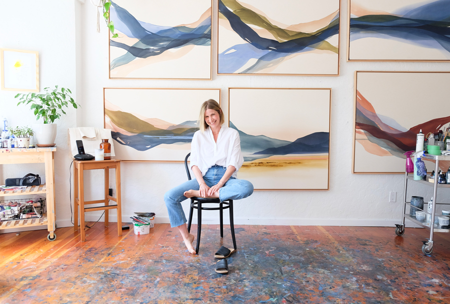
Lauren in her Studio – Photo by Sarah Reid
How would you describe your work and what’s your technique?
I describe my work as abstract paintings that are heavily influenced by both my natural surroundings and the physical nature of the paint itself. My process begins by pouring thinned-down liquid acrylics onto the canvas. I then guide the paint with my brush and tilt the surface back and forth until a band of colour reaches the desired translucency and form. I’ll work on several paintings at a time, as each pour takes about a day to cure before I can add another layer.
What is it about British Columbia that inspires you?
I’ve always been inspired by my environment and have found no matter where I travel, I invariably gravitate back to coastal B.C. Here, I’m able to strike the perfect balance between life and drawing inspiration for my work. My paintings reference the landscape, but not in a literal sense. I aim to capture the chromatic features of the coast – the shifting of light, the subtleties and movements.
Abstraction requires vision – what approach do you employ to see more deeply?
I think vision comes instinctively, but doing creative work regularly encourages your artistic intuition. Looking back at my paintings from a year ago, I can see an enormous amount of evolution. This comes from painting every day. The more you look at art and the more you create, the more you’re able to see.
Do you have any advice for people wanting to experiment with abstract art?
Take classes that focus on the process of painting rather than the end result. Experiment with different materials until you find something you love. Look at a lot of abstract art. And have fun with it!
Can you tell us a bit about the materials you use and the role they play in your work?
My paintings depend a lot on the attributes of my materials. I use liquid paint and water to achieve different levels of transparency. As they overlap, new colours emerge. The paint can be sensitive to temperature and I have to be careful not to add too much water as it impacts the quality. Testing paint every day can be time consuming and I often have to remix it, but I’m so immersed in this process now, I can’t imagine ever going back to full body acrylics!
“When you pay attention, ordinary things look extraordinary.”
CRISSY ARSENEAU
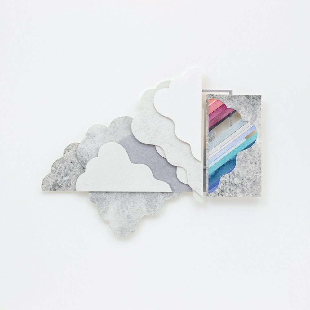
I Can Sense It
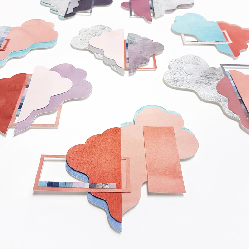
Cloud City
How would you describe your work and what’s your technique?
I create paper sculpture and watercolour collage works that explore order, attention, and contemplation in our often distracted world. Using watercolour and debossing, I add colour and texture to paper, which I then cut into stylized shapes and geometrics. These elements are composed into multi-plane works, abstract takes on the landscape where the natural and urban environments come together.
What is it about British Columbia that inspires you?
Having grown up in the interior and having spent my adult life in the Lower Mainland, I’m endlessly inspired by the varied, natural beauty found throughout the province. From rainforest to desert, mountain to ocean, earth to sky, it’s all glorious. I’m also very interested in how our urban environment interacts with its surroundings: when clouds are reflected back to us by the glass buildings or how plants find ways to grow in seemingly inhospitable places.
Abstraction requires vision – what approach do you employ to see more deeply?
Walking, stopping, and contemplating. There’s always so much to see that catches the eye: the changing sky, reflections in building windows, light streaming through the trees, birds flying by, the way the rain changes the colours of all it touches. I slow my pace and allow myself the time to look deeply and be curious, to appreciate what I might otherwise not have noticed. When you pay attention, ordinary things are extraordinary.
Do you have any advice for people wanting to experiment with abstract art?
One place to start is with an artwork you’ve already created or a photograph you’ve taken. Find the elements within it that you’re most drawn to – a few colours, shapes, or lines, a texture or a shadow, the basic flow of the composition – and recreate them (or the feeling they evoke) in a new piece. Try giving yourself some constraints in the materials you’ll use to do this and be playful within them. Remember that all the basic elements that apply to representational art are true for abstract art so, in a way, it’s not all that different.
Can you tell us a bit about the materials you use and the role they play in your work?
I use watercolour paper without gelatin sizing, professional watercolours, and a dextrin-based adhesive. The inherent qualities of these materials have informed how the work has developed. The luminosity and opaqueness of different watercolours on paper gives a certain feeling to each piece. Layering the naturally weighty paper and using different textures lends a dimensionality that I like to build upon, and the resulting work is often sculptural, playing with light and shadow. For almost all my framing, I use the Luna Shadow Frame.
“The energy, the movement, the juxtapositions of light and textures inspire me to paint.”
MICHELLE HESLOP
Colourblock 1
Your Chapter
How would you describe your work and what’s your technique?
Living a short walk to the sea informs my art and inspires my use of watery elements as a foundation for all my abstract work. In fact, most of my paintings start with water in a mop brush, laid down in a wet-on-wet technique with either ink or watercolour. I even collect Pacific seawater to use in some of my pieces – the salt makes lovely sediment. Using a combination of watery media, often juxtaposed with opaque acrylics, my work represents the shapes, forms, textures, lines and colours collected from my time spent observing in nature. To me, they are landscapes in full abstraction.
I’m attracted to the uncontrolled intuitive process of letting the colours move in the water, blend, and eventually fuse. While keeping white space and composition in mind, every shape made is a response to the former and the painting unfolds in an instinctual process.
To allow these organic forms to connect, I use mark-making to unite the piece. It’s a conversation between positive and negative space, freedom and constraint, uncontrolled media and meticulous markings. Stitching the shapes together with dots and lines creates a visual conversation. A dialogue that starts intuitively becomes deliberate – it’s a dance, or a push/pull, to really make a painting sing.
What is it about British Columbia that inspires you?
I am fascinated by the field of psychogeography which, in its basic form, is the impact of your surroundings on how you think, feel, and behave. The natural beauty of BC is my muse. I reside on Vancouver Island which is built mostly on rock and is surrounded by a rugged coastline. The majestic beauty where the mountains meet tide leaves me in awe – the deep greens of the moss and the moody Paynes Grey of the ocean in winter. My work is an abstract representation of this terrain. It’s the mutability of the Salish Sea and her craggy shores that provide a daily feast for me. Constantly fueled by curiosity, I paint what I observe in a reduced, simplified way. The energy, the movement, the juxtapositions of light and textures inspire me to paint. As an objective observer, it’s the connections I see in nature every day that spill out onto the paper.
Abstraction requires vision – what approach do you employ to see more deeply?
Nature is a synthesis of interconnected details. With paint and pens, I attempt to distill this complexity into simplified shapes, forms, colours and textures. I’ve become such an acute observer on my daily walks that now when I experience the Pacific Ocean, I see washes of Paynes Grey with splashes of turquoise and distinct lines where ripples once were. Almost as an editor, I oversimplify or reduce the essence of what I see to later translate onto the canvas. Rarely having a vision or a tangible subject in mind, I approach the canvas from a feeling, a memory, or essence of place.
Much like nature, abstract art is like a symphony – an experience of colour, pattern, composition, texture, line… not to be defined and ‘understood’ but to be explored and experienced. I let nature and abstract art wash over me, similar to a piece of music. Look beyond what you know and let abstract art take you in to your imagination; bathe in its mystery.
Do you have any advice for people wanting to experiment with abstract art?
I am so passionate about this subject and believe everyone is creative. I highly recommend using a sketchbook for experimentation and play. Every person should own one. Use it for words, drawings, paintings or all of the above. Use it for inspiration and growth. Finding your artistic voice is a marathon, not a sprint. You only need a few colours and any type of brush, even a tool from the kitchen or an old bank card will do. Just move the paint around and let yourself be free. Yes, paint and scribble like you are 5 years old again! There is no right or wrong. There are aesthetics to consider, like colour and value, but that will emerge naturally for you. When you’ve painted something you like, write it down in your notes so you can remember for next time. Build on that ‘aha’ moment. Abstract art is a muscle you need to develop and continually work on, to find your unique voice.
Allow your sketchbook pages to be outcome-free. Without a vision or expectations, it becomes completely intuitive; you will surprise yourself with what you are capable of. Therein lies the beauty of abstract art. Like Georgia O’Keeffe said, “I found I could say things with colour and shapes that I couldn’t say any other way – things I had no words for.” Let abstract art be your communication tool.
Can you tell us a bit about the materials you use and the role they play in your work?
My must-have materials are acrylic inks (Liquitex and FW by Daler and Rowney), Opus Essential Fluid Acrylics, GOLDEN Fluid Acrylics and Daniel Smith Watercolours for my watery media. GOLDEN Acrylics and Liquitex acrylic gouache and soft body acrylic offer gorgeous opaque hues. My Limited Edition Opus Allegro brush is my most coveted while I also couldn’t live without my Winsor and Newton 3 mop brush for laying down pools of water. Arches cold press 140lb watercolour paper is my absolute favourite surface for holding all the water and pigment I use in my work. For mark-making, Posca pens, Molotow, Pigma Microns are top of the list while Posca and Signo uni-ball in white are hardy enough to show up over acrylic paint.