New Portrait Assortment of Luminance Colours by Caran d’Ache
February 4, 2021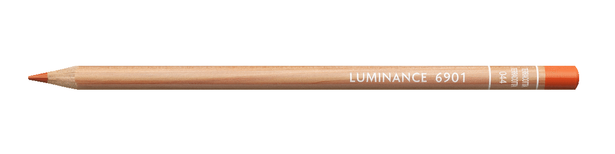
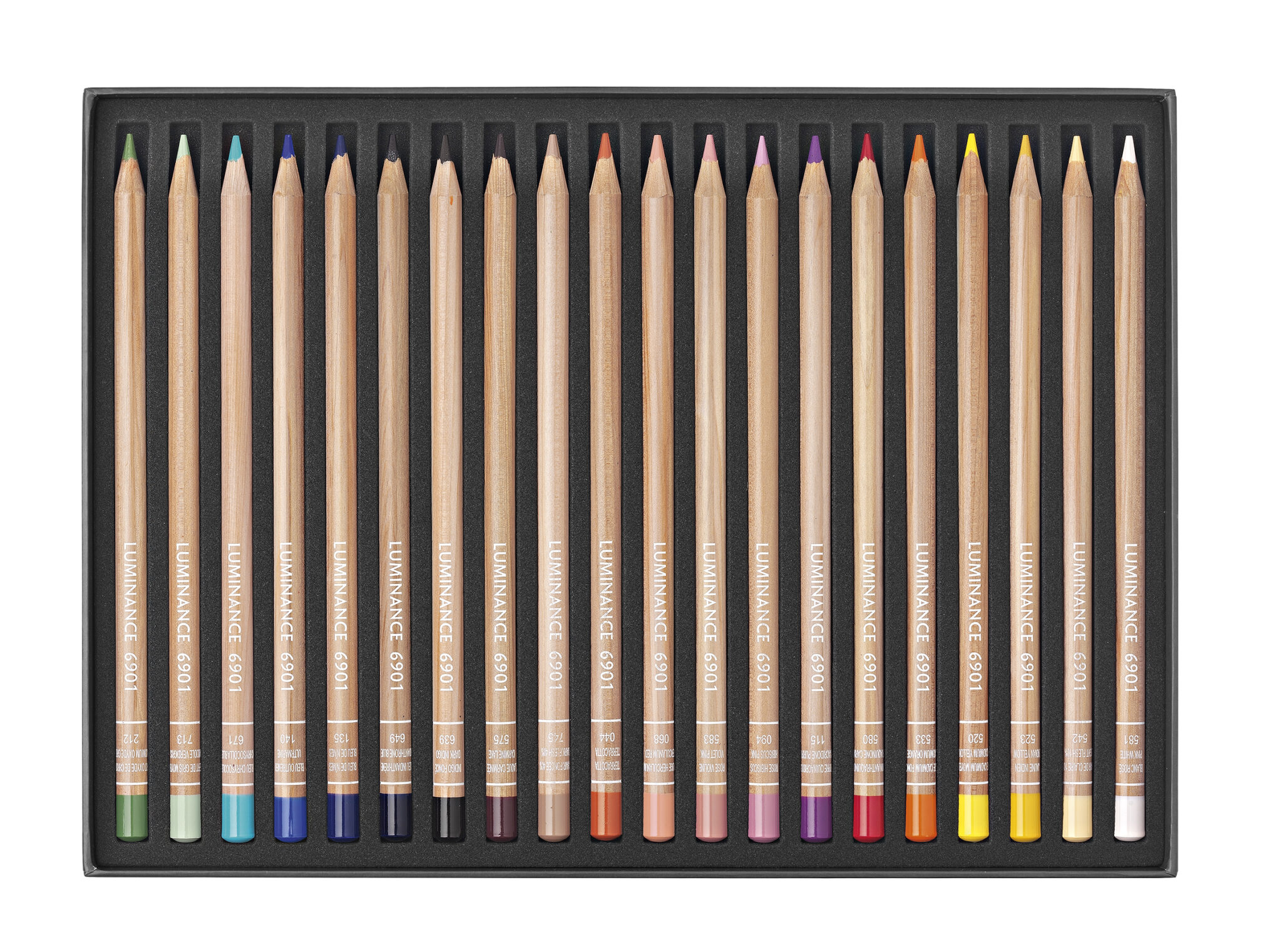
The new Portrait Luminance Assortment palette from Caran d’Ache offers a wide range of lightfast skin tones, with other additional colours well worth noting. A set that goes beyond being a Portrait Assortment for the person who may not be primarily a portrait artist. These pencils combine the best lightfastness in the world with the creaminess of a permanent lead!
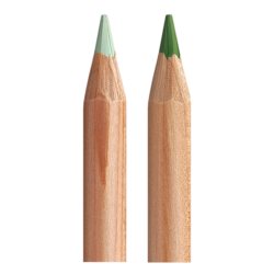
Middle Verdigris (713) and Chromium Oxide Green (212)
The Middle Verdigris (713) and Chromium Oxide Green (212) are greens in the grey-green range that render well without showing too-strong teal overtones. Ideal for leaves on tulips and daffodils and for distant foothills, for example. These two colours offer a subtle, elegant softness, with a hint of lively greys.
The additional blues are a welcome addition. From the lively aquamarine-like Chrysocolla Blue (671) to the rich and dramatic Dark Indigo (639), the blues work well for blueberries, morning glories, and even distant mountain ranges. Its worth mentioning that nothing from the original set compares to Chrysocolla Blue (671) except maybe Beryl Green (214) and Turquoise (171).

Chrysocolla Blue (671) and Dark Indigo (639)
The Bleu de Nimes (135) a deeper violet blue and an excellent pairing to the aforementioned Chrysocolla Blue. Luminance pencils do not need frequent sharpening, since they render such rich pigment quite readily; and have been known to be extremely versatile.
Anthraquinone Carmine (580) is a rich red that is not as fiery as a longtime favorite, Scarlet (070), but instead offers a deeper, richer crimson pigment.

Quinacridone Purple (115) and Carmine Lake (575) are saturated purplish-red colours which are reassuringly lightfast. Very different from the purples and violets in their original set, Quinacridone Purple will be very useful as a clear bright colour, while Carmine Lake is more subtle, almost brown and very useful for mixed darks.
The new Hibiscus (094) and Violet (583) pinks are unusual, somewhat neutralized pinks. Quite different from the original set’s Ultramarine Pink (083) and Anthraquinone Pink (571). According to a review by Melissa Miller Nece, they are similar to Prismacolor’s Clay Rose and Rosy Beige.
Terracotta (044) and Herculanum Red (068) are very nice for skin tones to add depth and shading. The Luminance Burnt Ochres (the full one and the 10% and 50%), are new reddish browns that partner very nicely with Terracotta and Herculanum Red. These are all warmer and redder than the Luminance Burnt Sienna’s and closer to the Sienna’s in other brands, which are used often for skin tones.
Overall, this new Portrait set from Caran D’Ache is bound to go down well with fans of the brand. With additional colours and rich pigments, these can be used for a variety of projects and not only for portraits.
*Information provided by Caran d’Ache and reviews written by Kristy Kutch and Melissa Miller Nece
EXPLORE THE CARAN D’ACHE RANGE