The Importance of a Split Primary Palette with Winsor & Newton Winton Oil Colours
August 9, 2021 A split primary palette, that is, one consisting of warm and cool reds, yellows and blues can also be understood as a limited palette. While a limited palette can be useful to artists of all abilities, for a novice it means less paint to purchase, less overwhelming choices when painting and learning more about nuanced colour because it forces you to mix rather than simply using paint straight from the tube. While limited in number of tubes on hand, it doesn’t necessarily mean you are limited in the colours that can be mixed.
Having a warm and cool version of each primary colour means that you can more easily create a desired mood within a painting. Using the subject of landscape for instance, imagine trying to paint a scene bathed in warm light with your three primary colours if each are cool in tone. While we instinctively tend to associate reds and yellows with warmth, thinking of things like fire and the sun, and we associate blues as being cool with images of water in mind, we in fact have a range of warm and cool primaries. Compare the cooler Alizarin Crimson with its blue undertones with the much warmer Cadmium Red Light whose warm yellow undertones make it feel quite orange. Tinting colours helps to bring out their full characteristics like temperature but it’s also important to be aware that tinting with Titanium white which is a cool, opaque white can make colours cooler so you may need to mix in a bit of a warm colour to counteract this effect.
A split primary palette can also help create colour harmony in your paintings. Too many colours can lead to chaos and a lack of focus. The simplification of a split primary palette can help provide a sense of control. Below, explore the six colours that comprise the Winton Oil Colour split primary palette.
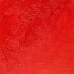
Permanent Alizarin Red is the primary red for the Winton range. Highly transparent with a blue undertone, Permanent Alizarin Crimson is a vivid red colour. Introduced in 1994, it has been formulated as a highly permanent red pigment.

Cadmium Red Hue is the secondary red. It is a strong mid-range red colour. It is a carefully selected combination of pigments closely matching genuine Cadmium Red.
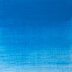
The primary blue for Winton is French Ultramarine. It is a rich transparent blue created by French chemist Guimet in 1828 as a synthetic but chemically identical alternative t the expensive pigment derived from Lapis Lazuli.

Cerulean Blue Hue, the secondary blue, is a bright blue pigment with green undertones. It is a careful combination of pigments closely resembling genuine Cerulean Blue.
Lemon Yellow Hue is the primary yellow within the Winton range. It is a strong mid-range yellow colour closely resembling genuine Lemon Yellow made from arylamide pigment.
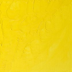
Cadmium Yellow Hue, the secondary yellow, is a warm yellow colour. It is a versatile rich mid-range yellow.

Take some studio time to mix with your split primaries and make notes of your experiments and you’ll find that there is a full range of possible hues at your disposal.