Underappreciated Colours in Your Palette
September 1, 2021Found within all artist’s paint collections are colour preferences that form our everyday palettes. We sway towards these important colours and they tend to give us the foundation needed to convey our style and emote our expressions. These are the core colours that we use and cherish, however there are a few underrated colours that we sometimes forget all about. These are our favourite “underappreciated” colours:

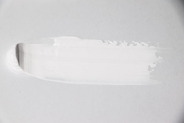
Titanium White
Did you know that this often overlooked colour in our toolkit tends to account for half to three quarters of paint used in most paintings? Titanium White is an artist’s best friend as it is the most opaque of all of the different whites. It has a strong tinting strength for mixing down highly saturated, opaque colours without the need to use excess amounts. Because of this opacity, Titanium whites are useful and sometimes necessary to effectively block out areas of a painting and can add dramatic highlights which in turn brings it to another level of realism.
In some cases, a more transparent white like a Zinc White is preferred in order to tint down colours that are more transparent or require something less dominant.
Learn more about whites in this great Gamblin article: https://opusartsupplies.com/articles/getting-the-white-right/

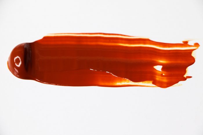
Quinacridone Gold
This is definitely a colour that at first glance, is not what it seems. Fresh out of the tube, it looks like a warm, rich brown, but it is very transparent and lends a glorious glow to paintings. The transparent nature means that it can be mixed to an impressive range of colours. It also mixes beautifully with many other colours and thins with mediums for “warming” glazes. Many artists have been able to replace their Raw Sienna and Yellow ochre with this single colour.
Learn more about Quinacridone Gold:
https://opusartsupplies.com/articles/unique-colours-quinacridone-gold/

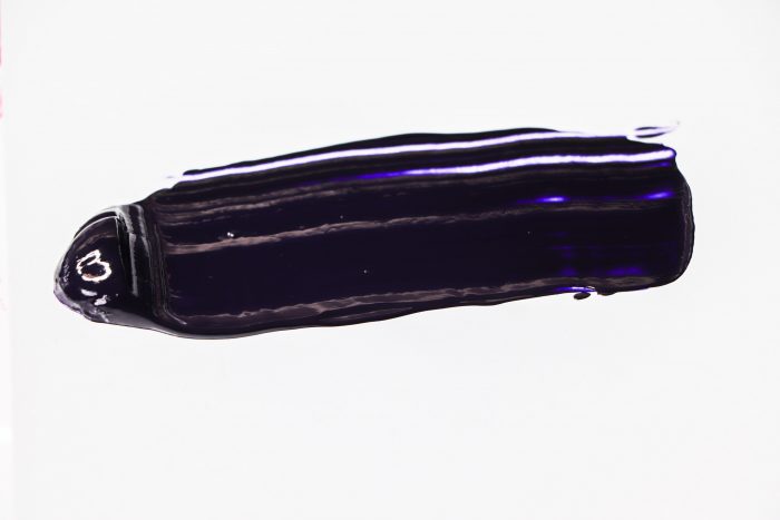
Dioxazine Purple
Purples are often considered to be a polarizing colour with mixed reviews. Some people really love them and others really don’t but knowing how to use them is the key to their success. Dioxazine purple is one of these and is a very useful and powerful colour. Being a cool colour with very high tinting strength as well as high transparency, it’s so strong that some artists will use it in replace of black. It mixes really well with other colours, and can either create nuanced shadows or add a pastel interaction (with the addition of white) to build on that dramatic lighting..
Learn more about Dioxazine Purple:
https://opusartsupplies.com/articles/winsor-violet-winsor-newton/

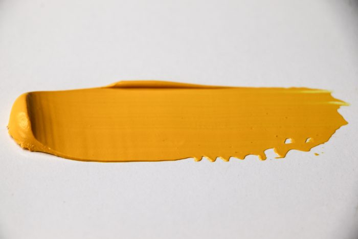
Hansa Yellow
In many ways all yellows are very underappreciated. You’d think that being one of the primary colours, it would be different, but Yellows are often not held to the same esteem like the other two, Red & Blue. Really consider the family of Hansa yellows!! Hansa Yellows are high tint colours, cleaner in masstone, brighter in tint, and it is very transparent. It’s transparency makes it ideal for glazing applications and is a wonderful go-to when needing something less opaque than a traditional Cadmium Yellow. In fact, you can also use it to intensify the tint of Cadmium Yellows.
Whatever the colour, always remember to experiment and perhaps you’ll discover a new avenue in your palette.
