Williamsburg Chromatic Darks
December 30, 2020Part Eight • Opus Unique Colours Series

When oil painters visit the Williamsburg factory, they always show them these colours. The response is unanimously positive, especially from those who use darker tones or blacks in their work. Williamsburg has six chromatic darks that we want to feature in this article. These colours are all blends, containing a natural iron oxide or Ivory Black and one or more strongly coloured pigments to give them their chromatic punch. When painted from the tube, they visually resemble a colourful black, but when scumbled, tinted or mixed, these darks start to show their true colours! Van Dyke Brown, Payne’s Gray (Violet), Turkey Umber, Courbet Green, Payne’s Gray and Indigo are all useful additions to the palette that can be used for underpainting, to neutralize and deepen chromatic colours, replace blacks or umbers or simply function as rich colours to enliven the darker areas of a painting.
Van Dyke Brown
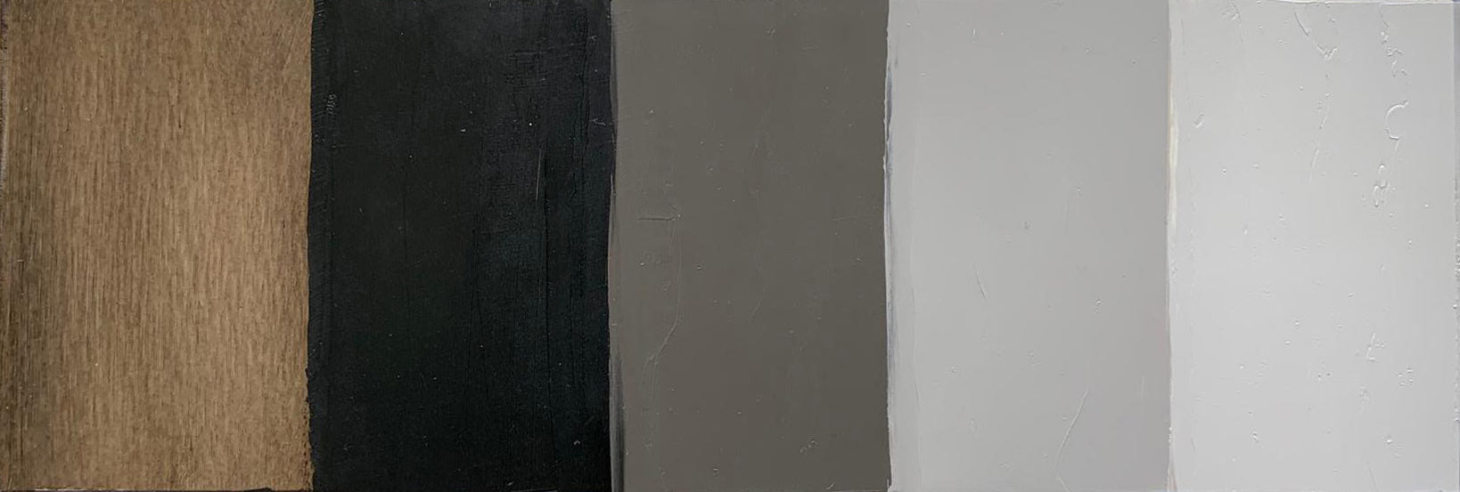 Van Dyke Brown left to right: undertone, masstone and three tints with Titanium White
Williamsburg have recently introduced a new formula for Van Dyke Brown that contains Ivory Black and Transparent Red Iron Oxide. Click HERE for more information on that change. It is a rich dark brown, bordering on a warm black, that can either take the place or bridge the gap between black and umber. It is semi-opaque, finely milled and fast drying. When mixed with white, it tints to a warm gray. Although semi-opaque, Van Dyke can modify transparent colours to produce translucent mixtures that can be slightly neutral with a wonderful glowing quality.
Payne’s Gray (Violet)
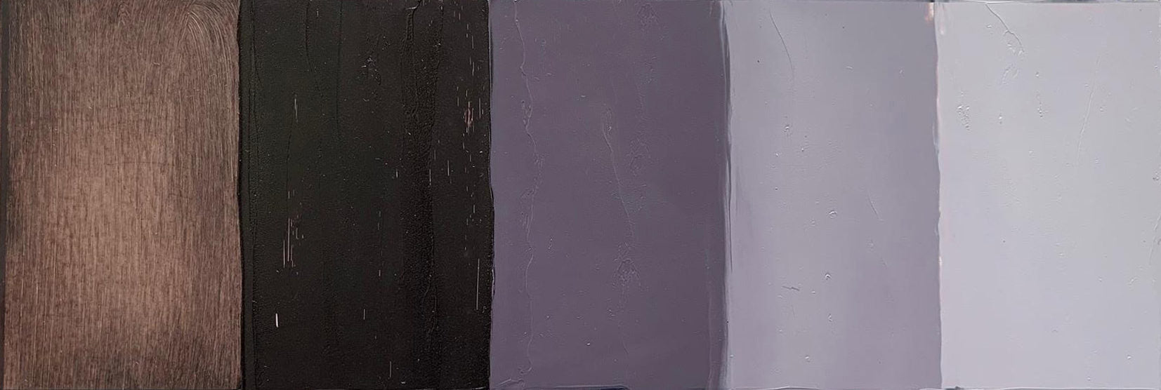
Payne’s Gray (Violet) left to right: undertone, masstone and three tints with Titanium White
Payne’s Gray (Violet) is a play on traditional Payne’s Gray. Instead of Ivory Black and Ultramarine, it contains Raw Umber, Dioxazine Purple (Williamsburg’s Egyptian Violet) and Ultramarine Blue. This is a dark, smoky purple, great for neutralizing lighter mixtures or for providing the base for shadows in portraits or landscapes. Payne’s Gray (Violet) tints to make a misty dull mauve, reminiscent of pleasant looking smoke or shadowy clouds. It mixes like a weak blue. It is semi-opaque, very fine and fast drying.
Turkey Umber

Turkey Umber left to right: undertone, masstone and three tints with Titanium White
Turkey Umber is a mixture of Raw Umber and Phthalo Green. It is one of those combinations that makes sense when you see it, but may not be something one would normally mix together. It is a semi-opaque, finely milled, fast-drying colour that can be used in combination with an earthy red or Burnt Umber as a warm/cool underpainting palette, or used as a dark, neutral green to hold down a landscape painting. Turkey Umber is a great alternative to Raw or Burnt Umber to reduce intensity with a little bit of a twist.
Courbet Green
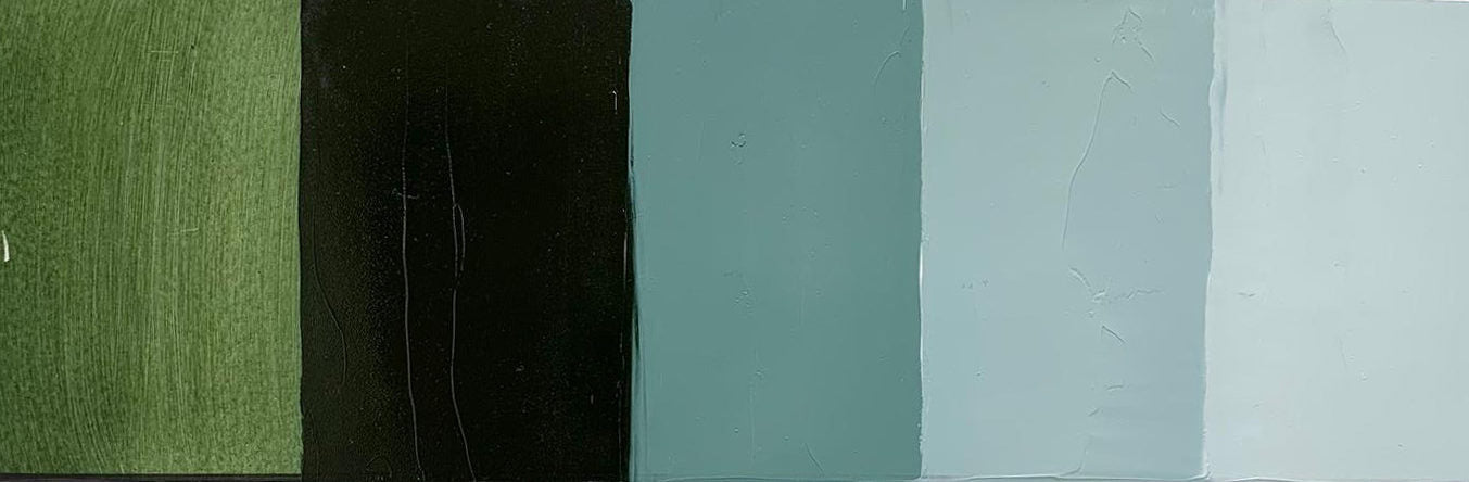
Courbet Green left to right: undertone, masstone and three tints with Titanium White
Calcined Yellow Ochre, Prussian Blue and Permanent Yellow Deep combine to make Courbet Green a sophisticated dark green. In masstone and undertone it appears warm throughout, but changes temperature when mixed with white. Courbet Green tints to a minty cool, bluish green. It is similar to Turkey Umber but more extreme in every way. The masstone is darker, the tinting strength is stronger and the range from warm, glowing undertone to cool tint is much more pronounced. It is semi-opaque, very fine and fast-drying.
Payne’s Gray
Payne’s Gray left to right: undertone, masstone and three tints with Titanium White
Payne’s Gray is a classic colour made with Ultramarine Blue and Ivory Back. It is essentially a more neutral version of Ultramarine. It can be used for skies, shadows for flesh tones, as an alternative to black and so much more. It is one of those colours that once it makes its way onto the palette, becomes universal and a frequent contributor to many mixtures. It is semi-opaque, fine, and dries within a couple days.
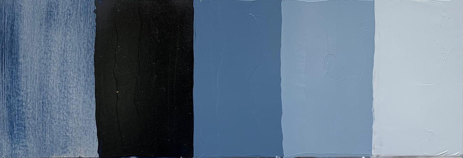
Indigo

Indigo left to right: undertone, masstone and three tints with Titanium White
Raw Umber and Prussian Blue combine to make Indigo a deep greenish blue with intense tinting strength. Similar to the relationship between Courbet Green and Turkey Umber, Indigo is Payne’s Gray’s intensely chromatic counterpart. Indigo has no relationship to the natural, organic dye derived from the fermented indigo plant, except for its potent ability to stain and render things blue. This is a tempered version of Prussian Blue, making it a little easier to shift mixtures without fully taking them over, as can happen when using straight Prussian. It is semi-opaque, fine, and very fast-drying.
Chromatic darks have been an important part of the Williamsburg palette since the company’s earliest days and remain so today. There are many opportunities to employ darker tones in a variety of painting styles from portrait and plein air to abstract and non-objective. We hope you enjoy these colours, and that one or several of them make their way onto your palette.
We would like to thank our friends at Golden for supplying Opus with this article written by Greg Watson
SHOP WILLIAMSBURG OILS